Maisie Owen – ‘Disconnections’ created in acrylic with stitch. Maisie says – ‘My piece explores the idea of being ‘at home’ by reflecting the feelings of boredom and detachment. The shallowness of the piece and repeated figures create a sense of entrapment, mirroring the frustration of being alone and isolated without connection to the outside world; I wanted to portray movement within my piece to show this, so stitched the outlines of empty figures, demonstrating almost a passage of time, yet there still being no escape from the monotony and disconnection of life ‘at home’.
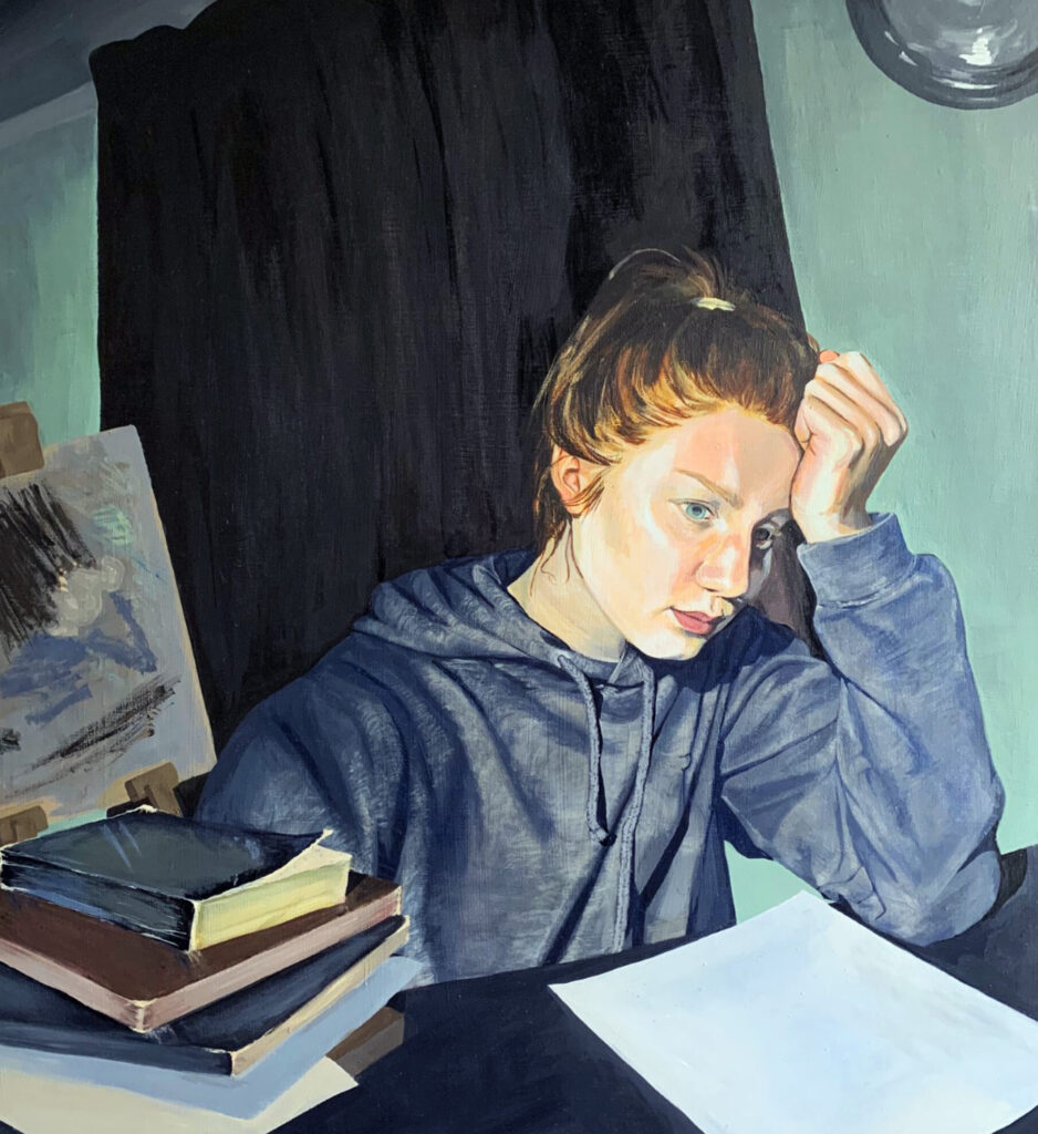
Rose Creer – ‘What day is it again?’ created in acrylic. Rose says – ‘I mainly focused on symbolism in this piece, there is a clock with no handles and the curtains are shut to highlight how during lock down, I have no sense of time. I’m dressed in a grey hoodie with messy hair and without makeup to represent how I don’t have time to make an effort, and struggle to look after myself in isolation. If you look at the piece from the side, you’ll notice how the hoodie turns to a bright blue, yet looking at it directly, the colour disappears. This is utilized to present how I am drained of my creative mind and excitement in my life. The books on the figure’s right are tattered and overused, the pile disjointed and mostly covered to create a sense of endless work. In the background, my easel holds a barely finished copy of the painting- behind me and staring at my back as if it’s waiting to be completed. Additionally, the disjointed angles and perspective of the piece give the painting an uncomfortable setting, and there is a sense of struggle to stay focused– like I am with my work. The greyish tones in general represent the dark times we are dealing with and colourless lives we have to live for now.’
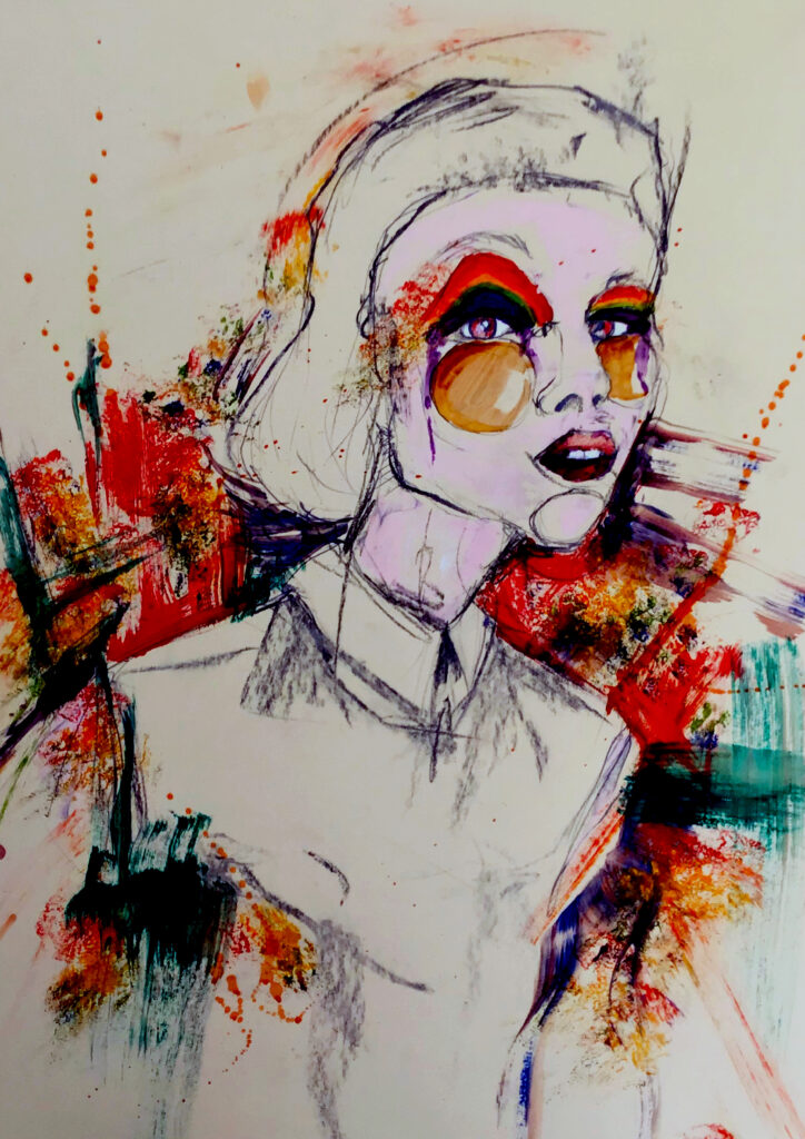
Sam Richardson – ‘Over the rainbow’ created in mixed media. Sam says – ‘My work is a dedication to the NHS, for their amazing work they are doing through this struggling time. I know it’s hard to put myself in their shoes, but coming from a key worker, I must say at times like these, you just want to be with your family. As a result, I have designed a fashion illustration inspired by the NHS. The rainbows you see are the symbols we use to show respect and our greatest condolences. My aim with this piece is to shed light onto the terrible situation each and every one of us has to face. So, from me and my family, THANK YOU ever so much!’
As well as our winners, Visual Arts staff also chose two students’ work as highly commended –
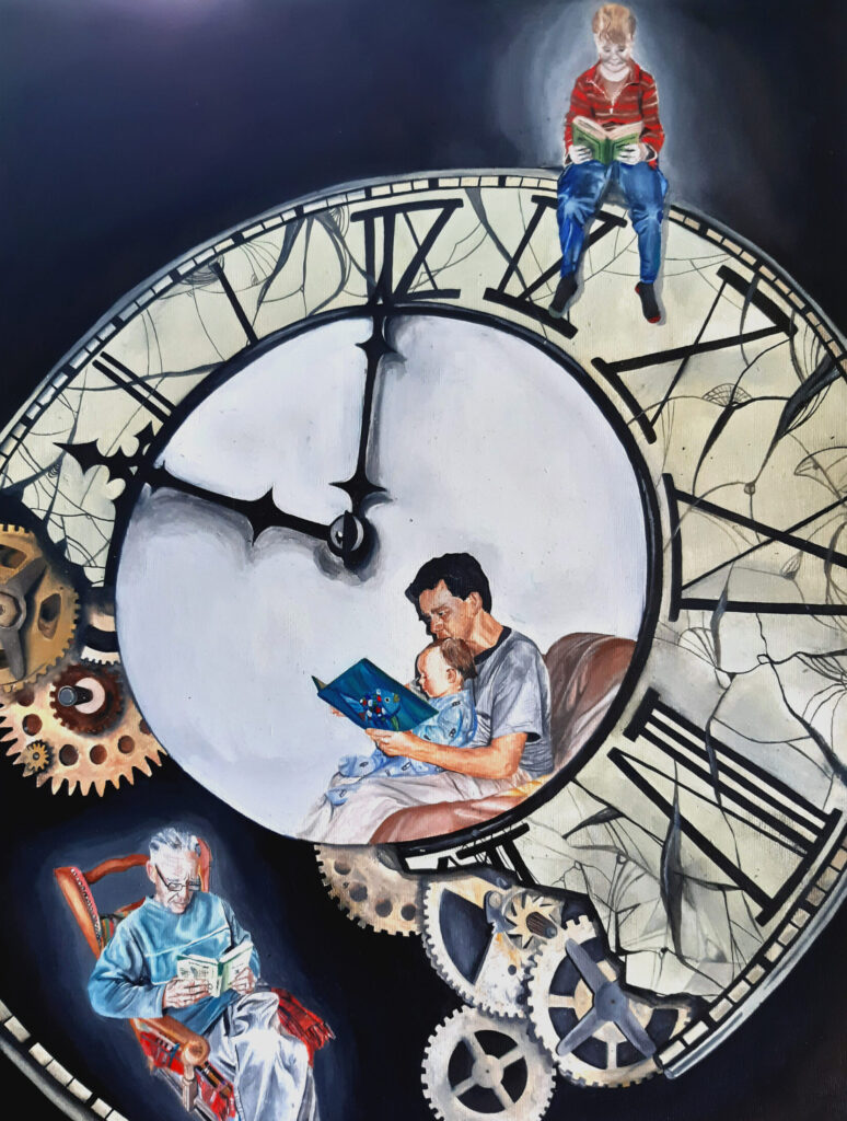
Karla Horridge – ‘Reading time’ created in oil. Karla says – ‘This A3 Oil painting was inspired by my Dad’s love for books. When I was thinking about the theme ‘at home’ I came to realize that home might not just mean a place, a house, a room, but instead the things and the people that make us feel at home. For my Dad, books have always been a way to feel at home, to enter a new world, at any point in his life. At a time where the whole country is in Lock down, more people are trying new (or old) things, such as reading, and I wanted to encompass this idea into my work too. What I have also found during these past couple of months at home is that time manages to somehow slowly creep forwards, yet also go by so quickly. This encouraged me to draw the clock the opposite way round and broken; symbolic of this strange sense of time. Merging these ideas into one piece of artwork, I have painted a broken clock, where my Dad as a little boy sits on top of it, reading, my Dad as a young man with my sister as a baby, reading, and my Dad as an older man, reading, showing how important books have been throughout his life.’
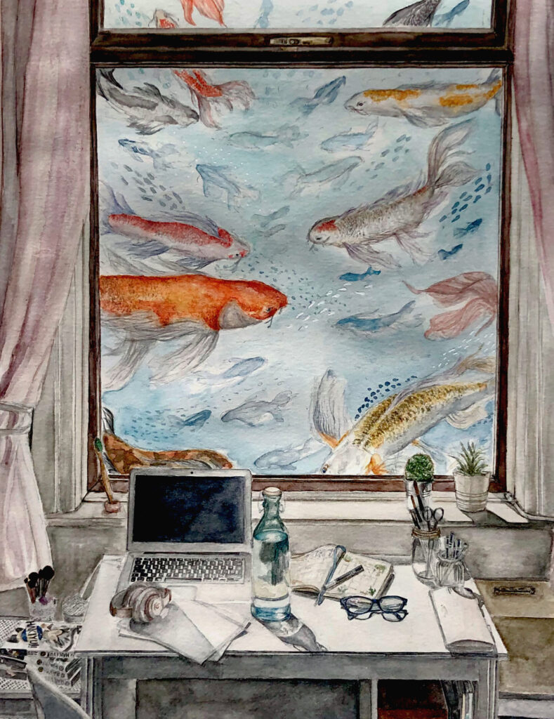
Amirah Ali-Headington – ‘Serenity’ created in Watercolor. Amirah says – ‘It is about how, despite feeling trapped or stressed during these times, we are never truly alone. In order to convey this I have shown how we each have our own space and that everyone’s space is unique to them; for me, my own room and items personal to me. I wanted a boarder around the piece to show the separation from others, not just physically but mentally as well. I chose darker, more muted colours for the interior to reflect how being inside can become suffocating, and I opted for more saturated colours for the outside to highlight the fish. The fish are there because they are proven to reduce stress, positively impact mental health and enforce daily routine, all of which help prevent loneliness. Stress, mental well-being, loneliness, and routine are all things people are struggling with during this time and I want people to feel comforted by my work and help them briefly forget their troubles.’


